One app written natively for three different platform
Context
Writing an app natively has benefits and drawbacks. Access to the latest capabilities, performance, and security are among the benefits. Some drawbacks include that writing natively does not allow for multi-platform release (web, android, apple), potential slow adoption, and often different user experiences due to design choices. The intent of this work is to determine whether it's possible for an indie developer like myself to learn and develop native apps for Apple, Android, and Web. This would be based on availabel materials across the web and on the respective websites. This post is opinionated in that we will chose specific frameworks to work with. For Apple, Swift and SwiftUI will be used. For Android, Koltin and JetPack Compose. For the web, SvelteKit and TailwindCSS will be used. I will consider effort in getting a project up and running, developing product capability, and having a level of testing. This article isn't intented to deep dive into the specifics of each language or framework. The intent is to understand how difficult it is to create similar User Experiences across these three platforms with native declaritive capabilities.
What are we making?
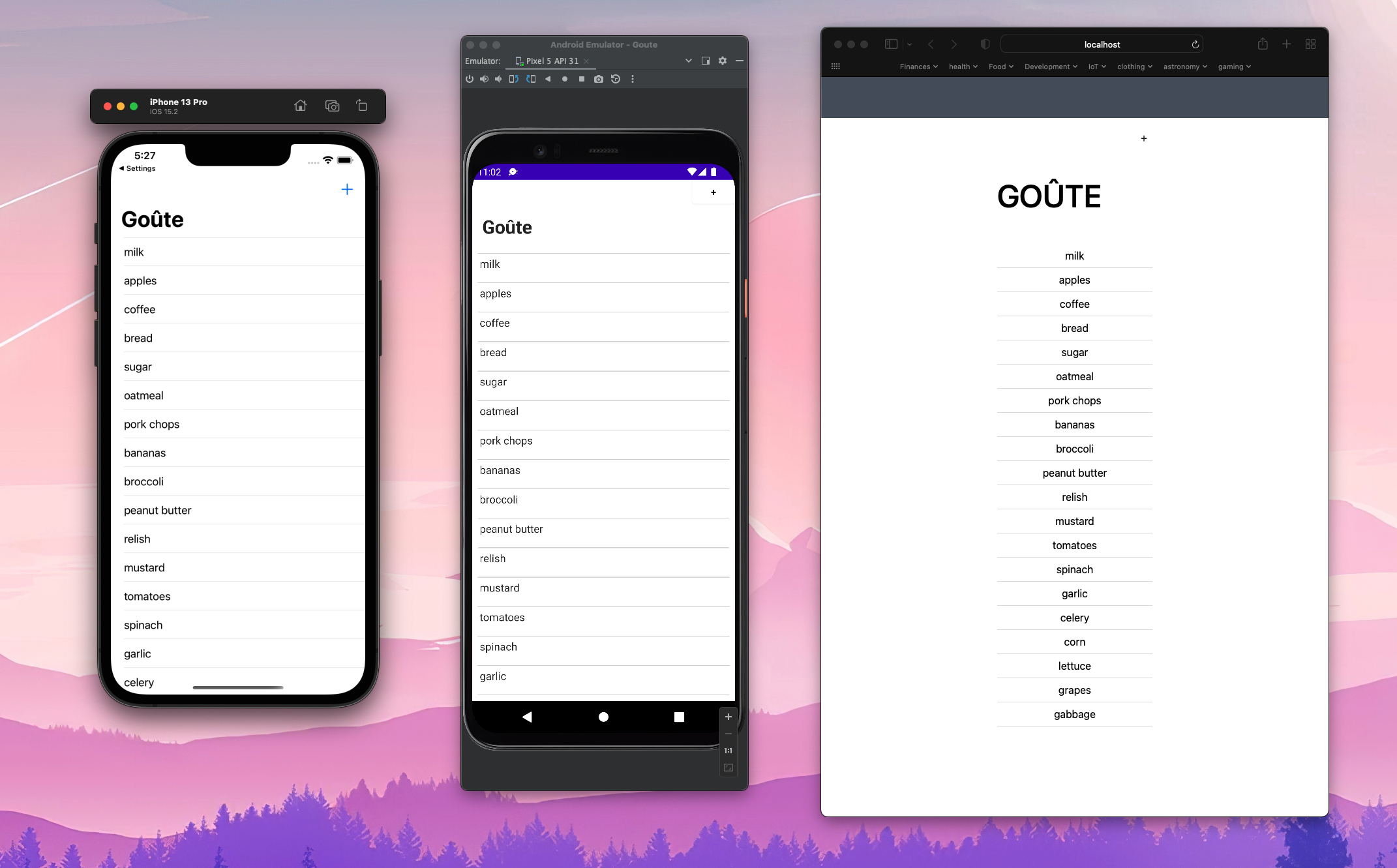
This will be a simple To-Do List application titled Goûte. There are two main capabilities for this application. List an existing set of To-Do items stored in a JSON file and add new items to the list. An attempt will be made to maintain the same User Experience through consistent layout of User Interface elements. Although not perfect, the end result will be three apps that similar experiences for the user. The journey to get there is what we will cover in this post.
Getting started... the setup
In general getting set to develop for each platform has varying degrees of difficulty. Especially if you are considering elements like sharing supporting multiple contexts for each platform or more importantly, automating tests. Apple being the most batteries included where web is much more of a "pick your poison" approach.
Apple
Getting set up for Apple was the simplest of them all. If you are starting from nothing, downloading Xcode will take some time, but everything else is fairly "batteries included. Starting a new multi-context application is simple, allowing you to develop an app for phone, tablet, and desktop with just a few button clicks. This includes working tests based on what is present in the code.
Android
Getting set up with Android took some effort. If you are starting from nothing, downloading Android Studio isn't too bad. However, Android Studio does lot of updating and downloading of libraries once the app is installed. This can take time. Starting a new multi-context application is also simple, allowing you to develop an app for phone and table with a few button clicks. You do have to make some interesting choices about targets to ensure the app can run on most Android phones and tablets. The tests that are included do not reflect the code and take some effort to get setup.
Web
Getting set up to do Web development is probably the most daunting. One could get old school and just use plain HTML, CSS, and Javascript. That approach create unnecessary headaches. Over the years, there has been a lot of tooling and plenty of frameworks created to reduce the stress of creating interactive web applications. This is where you have to get opinionated in your choices. I chose Svelte+TailwindCSS as the two together seemed to complement the declaritive nature of both SwiftUI on apple and Jetpack Compose on Android. You also have to get opinionated about testing frameworks also. For this exercise, I am using Jest and Playwrite for testing.
Get coding... the joys and pains
Apple
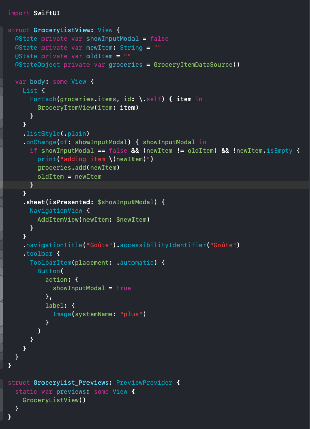
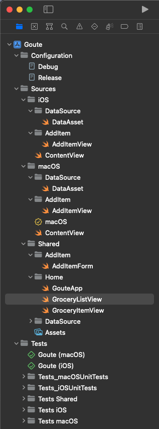
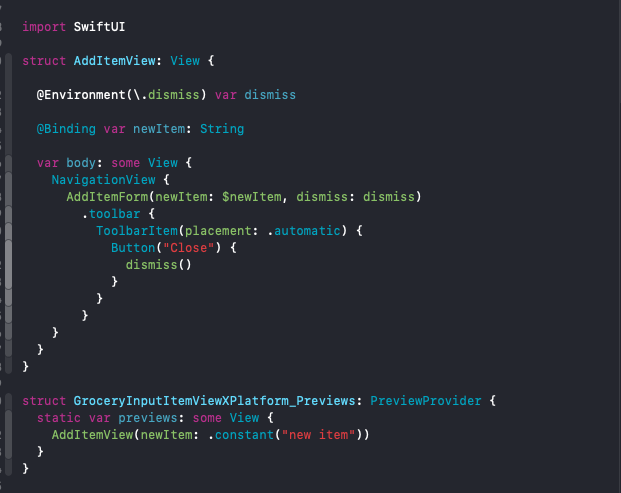
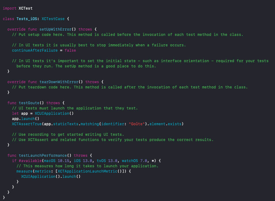
On Apple platforms, loading a list from a file and displaying that information is fairly straight forward. Introducing navigation created some challenges when attempting to ensure the behavior was similar between macOS and iOS. to manage for this, separating certain code elements is much more clean than compiler directives (#if statements). Displaying a modal that allows the user to input a new item was also fairly straight forward. The work comes in when you are working to tie the modal output back to the original list. Without too much detail in this writeup, Apple uses capabilities like State, StateObjects, and Bindings to handle these things. I chose this route over another path (EnvironemtObject) to avoid passing around entire data sets. Testing is also pretty straight forward. With the advantage of impacting accessibility as you set up tests.
Android
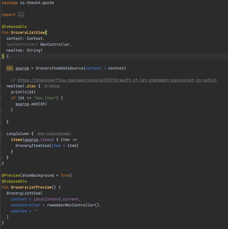
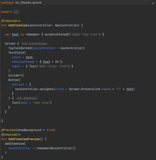
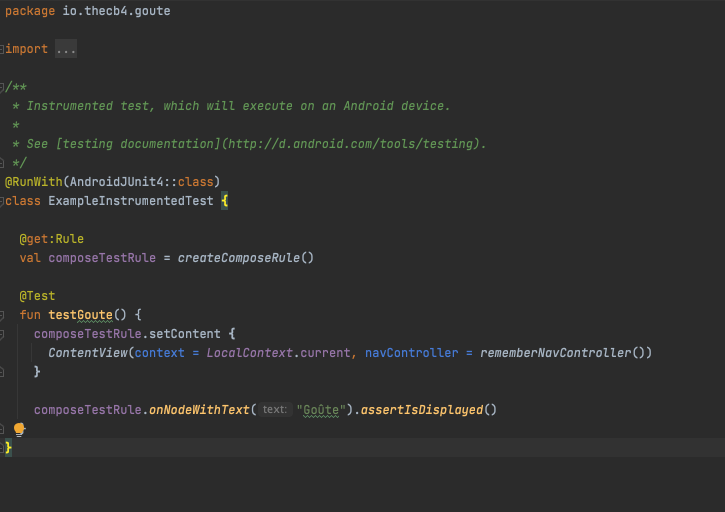
On the Android platforms, loading a list from a file actually took some effort. I am using the same JSON file across all three platforms and referencing and loading the JSON file quite a bit more code. That is on top of having to find a library to load the file as a set of JSON objects. I used the GSON library for this. Introducing navigation was complicated. There is a lot of overhead in developing routes across the app for navigation to work. As Jetpack Compose, I hope that the navigation pattern simplifies. Displaying a modal was not much effort than on Apple. Moving data between views was also fairly straight forward. Getting the Android app to look like the Apple app took some effort. Whereas Apple starts with layouts that put content at the center of the screen, Android start with content in the upper left and you have to add layout modifiers to get to a similar UX. Testing took some effort to understand. Separating out unit versus user interface testing was not very clear. Once it was set up, they ran smoothly.
Web
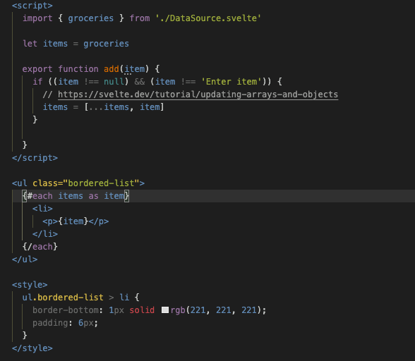
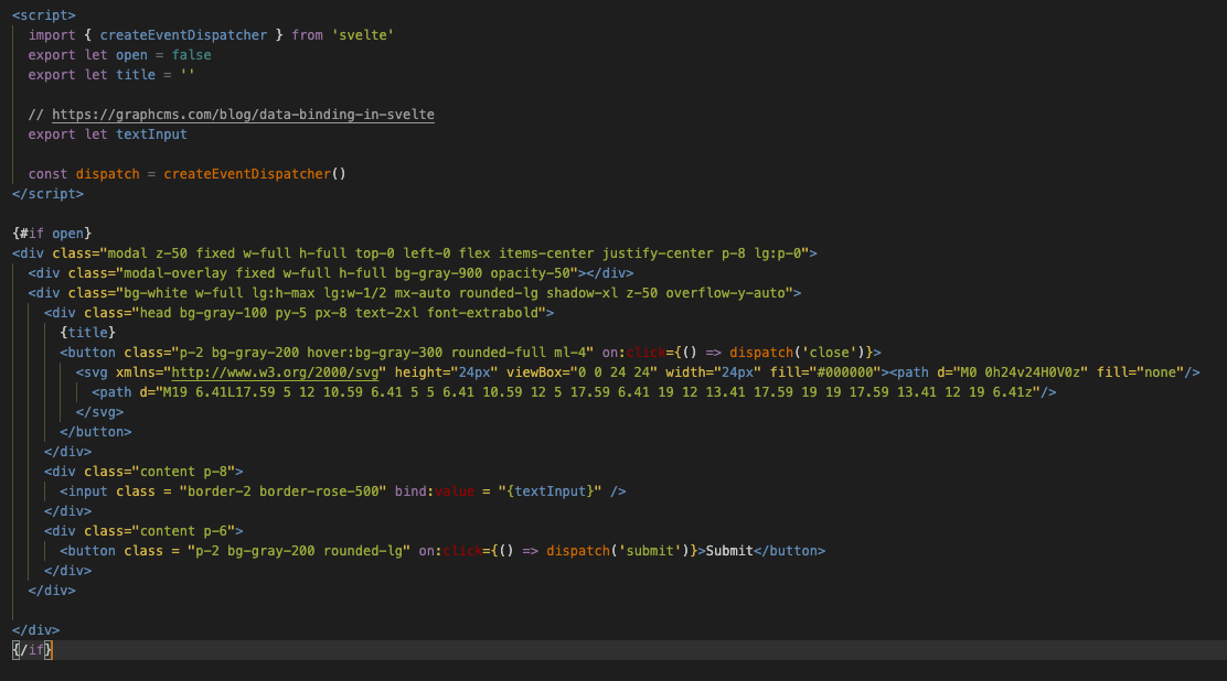
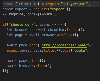
For the Web, loading a list from a file and displaying it was the easiest. There are no concepts of navigation similar to the other platforms so those elements had to be created from scratch. They were not difficult to create. Defining a modal and passing data between views had similarities between Swift and Kotlin and was fairly easy to reason about after reviewing a few tutorials. Setting up testing was extremely tough. I settled on using Jest + Playright as it gave me the broadest support for unit testing and for user interface testing with multiple browser types.
What was learned?
- Apple is very “ batteries included / opinionated”. Slow to determine how to change to different UX. Tutorials are getting better for SwiftUI
- Android is somewhat “batteries included”, it not too opinionated. That being said, it is slow to get the UX you are expecting. The tutorials are bad for JetPack Compose
- Svelte is “no batteries included”. Getting to the expected experience with both Svelte and TailwindCSS is very slow. There are little to no tutorial using both Svelte and TailwindCSS together.
Having done this once could I explain what I did? The differences for loading data? Yes. Web - easiest, Apple - Moderate, Android - hard How to display items in a list? Fairly similar to each other How to navigate between views? Apple - easiest, Web - Moderate, Android - Hard How to pass data between views? Each of them are difficult in their own way How to update the existing list with new data? All are relatively straight forward. How to create and run unit and user interface tests? Apple - easiest, Web - Hard, Android - Hard
Android Jetpack Compose is more verbose than SwiftUI, requires more building of components than SwiftUI. That being said, Skvelte and TailwindCSS doesn’t have anything built in and would require an additional library built on top for components to drive more semantic development.
Given the declarative nature of three platforms, one way to drive scale is through strong UX. If it is clear what behavior is expected, then defining common components separate from business logic is possible. That being said, the effort to switch between the three contexts is still pretty high. This is driven by Navigation and Data Flow. The more simple the app, the more likely that one person can get something up, running, and deployed.